The Synapse website undergoes a over-haul every year to stay in sync with the theme for that year. Since the last year, I’ve been the webmaster and programmer for the website. Which means I do all the HTML/CSS/JS/PHP/SQL dirty work.
This year’s theme for Synapse is “Silver Screen”, having to do with legendary movies and so on. Their is always the need to bring something new to the website, something that differentiates it from a normal website. At the same time it has to:
- degrade on older browsers
- be standards compliant
- have clean URLs
- readability
- look good in 1024x768
The last requirement is a by product of the maximum screen resolution in our computer labs. Finally, I’m the kind of person that develops kinesthetic memory about websites and like things to happen fast. If I’ve to wait for a navigational element to load before I can click on it, that just annoys me.
The Synapse website team is listed on the contact page. We started working in October. I don’t remember how, but we had agreed to use horizontal scrolling. It was either that or a 4 way grid like NoFrks. I had seen it in action at Join the Game and it looked good if executed well.
Platform choices
Our website is powered by: * CodeIgniter * MySQL
The backend is virtually untouched from the 2010 version. CI uses great url –> filename mappings, and I took full advantage of that to create a very dynamic website. Helpers are another use advantage. For an example, quite a lot of events require registration. Manually going to every page and adding an event specific link seemed like too much effort. Instead I inserted a common function in every page, and the function consults a table to see if the event actually requires registration or not, and returns the appropriate link. Given a choice I’d liked to use Python, but our server does not support it, and this way was probably better in time savings.
On the client we use: * jQuery * jCarousel * simplemodal * tinyTips * easing * lightbox * scroll * Some CSS3 for rounded corners and WebFonts when available
CI also allows clean URLs using routing and so that problem was solved. With a ready backend, we had much more time to work on the frontend.
The site works in IE > 7 and any relatively new Firefox and Chrome. It was never tested in IE6 because we didn’t have access to one. Finally, most visitors are engineering college students who are quite likely to use modern browsers.
Navigation
For a website like Synapse, which has 3 level events, the navigation can be a make or break. I wasn’t so happy with last year’s attempt which had too much hover, and the users had to search three levels deep if they forgot where the event was.
An initial attempt at a better navigation was made using SpaceTree. It is a really good navigational tool, and significant effort was invested in trying to make it fit the Synapse event model. The plan was that on the Events landing page, the SpaceTree would be the main content, and clicking on a event, would open the event details in a modal dialog. But that just sucks. I wanted to remove as many click’s as possible. The next option was to shift the SpaceTree a bit to the left and fit the content to the right. But with the 1024px constraint, that wouldn’t work. Meanwhile I was facing some issues with the spacetree, it requires a special script to work in IE, was causing graphic glitches in a Chrome beta, and wasn’t behaving nicely in terms of firing events. The Javascript Visualization toolkit is really good, but it didn’t cross over well to navigation.
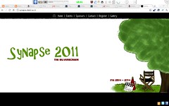
We decided to remove an entire level by showing the navigation in a modal dialog. So all the Technical events get shown together, all the Cultural together and so on. This still means two clicks to get anywhere, but gives users a very obvious heirarchy, while at the same time not requiring them to remember anything except the name and the category (which is usually quite obvious). The current representation is of course dependent on the theme, but I’ve to stick to a certain order in this article. Chronologically the theme plan came after the SpaceTree idea and before this one. We had two iterations even in the current situation. The first one was to push each navigation ‘card’ to the top left, over the green of the joker’s head. That would leave us with more space for content. But it clashed horribly, and was too small. Also our site is such that my cursor is much more likely to be to the right of the screen, so it went to the right.
The Theme
Agreeing on a design to represent the theme was the hardest part of the entire endeavour (the second hardest was getting it to work in Internet Explorer). The Synapse website has 4 main areas:
- Landing
- Events
- Sponsors
- Contact
Registration can usually be put in a separate window or per event. We had four characters also finalised.
- Gabbar from Sholay
- Amitabh Bacchan from ? ( yes I don’t know my Bollywood films )
- King Leonidas from 300
- The Joker from The Dark Knight
The first plan was to have a movie projector on the landing, with the Synapse logo embossed into it. Each navigation pane would be film-strip like. But that is a cliche cliche. I distinctly remember ideas involving, flowers and 4 coloured sarees. Then somebody stumbled upon Lucuma. Oh, by the way:
The secret to creativity is knowing how to hide your sources. — Albert Einstein
That was it, we had the motivation and the final vision. Merging the scenes from one to another was a very good idea. In addition, if you notice the Synapse website carefully, certain parts of the background are shown only while changing the page. It was a bit tricky to get jCarousel to play nicely with that, but I got it working in the end. The Tree to Joker transition remains my favourite part of the site.
That week of 25th-31st October, we had a 109 commits in total (out of the overall 154 till now). So the team did work their asses off.
The rest was pretty spartan. A very simple black and white theme. The top navigation font is Neucha. Incidentally, we use Sans Serif fonts all over, including the main copy, because we don’t have much to read, and dropping the serif means more ‘white’ space. The character on each page adds a distinctive look. The top edge has a frayed look, but the bottom edge doesn’t. This is because while top margin positioning works across all browsers, the same doesn’t hold for bottom. It varies a lot with screen resolution and browser version and none of us had that good an understanding of the box model, or the arsenal of tricks more seasoned web-devs have to make this work.
The little things
Clicking on any events takes you to a event page, where all the top links scroll, except ‘Home’, which will refresh the page. This is intentional. The hash tag and jCarousel do not play well together. jCarousel has problems with indexing the right spots in the element list. So a hashtag couldn’t be used. Leaving the landing page their would mean a delay or click to get to the main content. But reordering the landing page on all the event pages would break consistency. With caching the home click should be almost instantaneous. So it was a compromise, and one that we should plan for next time.
The sub-headings in events and contacts are generated with javascript. The actual thing is just some
s, but scrolling in that tiny area can become tedious. So a domready hook collects all the h2s and create’s ‘tabs’ out of them. jQuery is good for these kind of things.
The registration page tries to be nice. If you’ve already registered before, details like your name, and phone number get filled in automatically. For students inside the college this is instantaneous, and a major time-saver. Since more than half of our participation is from within college, this is a very good usability improvement.
The second usability issue in the registration form is quite subtle. If you enter the wrong password, focus is immediately drawn back to the password field. But if you focus on a different field again, it won’t pull you back the second time. This is because it is quite possible that I want to fix the username instead of the password, and always pulling focus to the password again wouldn’t allow that. So alert the user once, but give up after that. Of course, the values are double checked upon submission, so security is not compromised.
Finally by asking DA-IICT students for 9-digit IDs we can always contact them while ensuring uniqueness, while also auto-filling the institute name and removing the option for accomodation, ensuring that people are only shown what is required.
The horizontal partition puts a physical differentiation between common fields and per-event fields. In fact, we can even add custom fields for events which require them, by simply making entries in the events details and the page will automatically include them.
In summary, the Synapse website is a pretty good architecture, and quite well thought out. There are certain improvements that are visible in hindsight, but which we looked over inthat one week of crazy work. The result is quite stunning though.
Really nice work :). HTML5 and CSS3 have some really cool stuff which can reduce your JS work. But it works only in IE9, Chrome 7+ and firefox 3.5+. Check http://slides.html5rocks.com/.
ReplyDeleteThis comment has been removed by the author.
ReplyDeletethere are so many things running in the background which gives this site an awesome look. The vertical carousel effect is mindblowing.
ReplyDeleteBut what is
"when the ping program terminates, stop the packet capture in wireshark " :P
A tribute to that meme :)
ReplyDelete